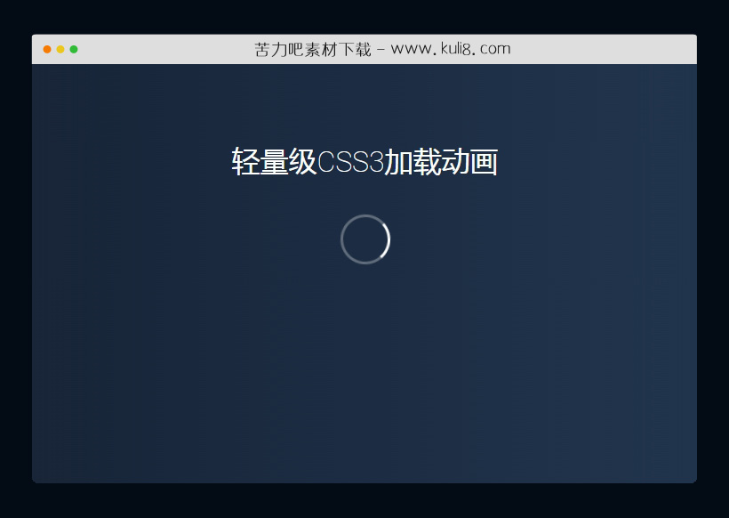

资源描述:一款由css3创建的加载动画,圆形环状的加载动画特效,简单实用,在html里面加入: 即可看到效果。
CSS3创建的旋转加载动画特效代码(共2个文件)
- index.html
使用方法
#loading {
  display: inline-block;
  width: 50px;
  height: 50px;
  border: 3px solid rgba(255,255,255,.3);
  border-radius: 50%;
  border-top-color: #fff;
  animation: spin 1s ease-in-out infinite;
  -webkit-animation: spin 1s ease-in-out infinite;
}

@keyframes spin {
  to { -webkit-transform: rotate(360deg); }
}
@-webkit-keyframes spin {
  to { -webkit-transform: rotate(360deg); }
}
站长提示:
1. 苦力吧素材官方QQ群:950875342
2. 平台上所有素材资源,需注册登录会员方能正常下载。
3. 会员用户积极反馈网站、素材资源BUG或错误问题,每次奖励2K币。
4. PHP源码类素材,如需协助安装调试,或你有二次开发需求,可联系苦力吧客服。
5. 付费素材资源,需充值后方能下载,如有任何疑问可直接联系苦力吧客服
1. 苦力吧素材官方QQ群:950875342
2. 平台上所有素材资源,需注册登录会员方能正常下载。
3. 会员用户积极反馈网站、素材资源BUG或错误问题,每次奖励2K币。
4. PHP源码类素材,如需协助安装调试,或你有二次开发需求,可联系苦力吧客服。
5. 付费素材资源,需充值后方能下载,如有任何疑问可直接联系苦力吧客服
PREVIOUS:
NEXT:
相关资源 / 动画效果


😀
- 😀
- 😊
- 😂
- 😍
- 😑
- 😷
- 😵
- 😛
- 😣
- 😱
- 😋
- 😎
- 😵
- 😕
- 😶
- 😚
- 😜
- 😭
发表评论