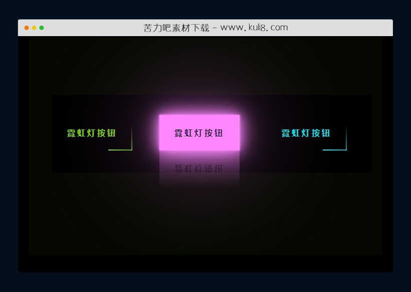

资源描述:一款动画边框和鼠标悬停效果代码,按钮带有三种不同的霓虹灯动画边框和悬停时的渐变的灯光效果。
css三种不同的霓虹灯动画边框和悬停特效代码(共2个文件)
- index.html
使用方法
.neon__button a{
    position: relative;
    display: inline-block;
    padding: 25px 30px;
    margin: 40px 0;
    color: #03e9f4;
    text-decoration: none;
    text-transform: uppercase;
    transition: 0.5s;
    letter-spacing: 4px;
    overflow: hidden;
    margin-right: 50px;

}
.neon__button a:hover{
    background: #03e9f4;
    color: #050801;
    box-shadow: 0 0 5px #03e9f4,
                0 0 25px #03e9f4,
                0 0 50px #03e9f4,
                0 0 200px #03e9f4;
     -webkit-box-reflect:below 1px linear-gradient(transparent, #0005);
}
.neon__button a:nth-child(1){
    filter: hue-rotate(270deg);
}
.neon__button a:nth-child(2){
    filter: hue-rotate(110deg);
}
.neon__button a span{
    position: absolute;
    display: block;
}
.neon__button a span:nth-child(1){
    top: 0;
    left: 0;
    width: 100%;
    height: 2px;
    background: linear-gradient(90deg,transparent,#03e9f4);
    animation: animate1 1s linear infinite;
}
@keyframes animate1{
    0%{
        left: -100%;
    }
    50%,100%{
        left: 100%;
    }
}
.neon__button a span:nth-child(2){
    top: -100%;
    right: 0;
    width: 2px;
    height: 100%;
    background: linear-gradient(180deg,transparent,#03e9f4);
    animation: animate2 1s linear infinite;
    animation-delay: 0.25s;
}
@keyframes animate2{
    0%{
        top: -100%;
    }
    50%,100%{
        top: 100%;
    }
}
.neon__button a span:nth-child(3){
    bottom: 0;
    right: 0;
    width: 100%;
    height: 2px;
    background: linear-gradient(270deg,transparent,#03e9f4);
    animation: animate3 1s linear infinite;
    animation-delay: 0.50s;
}
@keyframes animate3{
    0%{
        right: -100%;
    }
    50%,100%{
        right: 100%;
    }
}


.neon__button a span:nth-child(4){
    bottom: -100%;
    left: 0;
    width: 2px;
    height: 100%;
    background: linear-gradient(360deg,transparent,#03e9f4);
    animation: animate4 1s linear infinite;
    animation-delay: 0.75s;
}
@keyframes animate4{
    0%{
        bottom: -100%;
    }
    50%,100%{
        bottom: 100%;
    }
}
站长提示:
1. 苦力吧素材官方QQ群:950875342
2. 平台上所有素材资源,需注册登录会员方能正常下载。
3. 会员用户积极反馈网站、素材资源BUG或错误问题,每次奖励2K币。
4. PHP源码类素材,如需协助安装调试,或你有二次开发需求,可联系苦力吧客服。
5. 付费素材资源,需充值后方能下载,如有任何疑问可直接联系苦力吧客服
1. 苦力吧素材官方QQ群:950875342
2. 平台上所有素材资源,需注册登录会员方能正常下载。
3. 会员用户积极反馈网站、素材资源BUG或错误问题,每次奖励2K币。
4. PHP源码类素材,如需协助安装调试,或你有二次开发需求,可联系苦力吧客服。
5. 付费素材资源,需充值后方能下载,如有任何疑问可直接联系苦力吧客服
PREVIOUS:
NEXT:
相关资源 / 动画效果

😀
- 😀
- 😊
- 😂
- 😍
- 😑
- 😷
- 😵
- 😛
- 😣
- 😱
- 😋
- 😎
- 😵
- 😕
- 😶
- 😚
- 😜
- 😭
发表评论