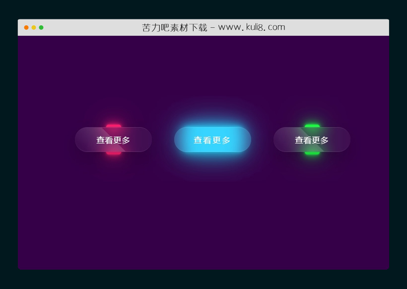

资源描述:当将鼠标悬停在button按钮上时,会触发透明玻璃状动画进行变换。网站上增加这些动画效果,可极大的增强网站交互性和较好的用户视觉体验。
基于css3鼠标悬停按钮触发的发光动画特效代码(共2个文件)
- index.html
使用方法
* {
  margin: 0;
  padding: 0;
  box-sizing: border-box;
  font-family: 'Onest', sans-serif;
}

:root{
  --color-white: #fff;
  --color-1:#350048;
  --color-2:rgba(255, 255, 255, 0.05);
  --color-3:rgba(0, 0, 0, 0.2);
  --color-4:rgba(255, 255, 255, 0.1);
  --color-gradient-1: rgba(255,255,255, 0.15);

}
.cd__main{
   background: var(--color-1) !important;
   min-height: 640px;
   align-items: center;
   margin-top: 50px;
}
body {
  position: relative;
  display: flex;
  justify-content: center;
  align-items: center;
  min-height: 100vh;
  background: var(--color-1);
}

.container {
  width: 600px;
  display: flex;
  flex-wrap: wrap;
  justify-content: space-around;
}

.container .btn {
  position: relative;
  width: 155px;
  height: 50px;
  margin: 20px;
}

.container .btn a {
  position: absolute;
  top: 0;
  left: 0;
  width: 100%;
  height: 100%;
  display: flex;
  justify-content: center;
  align-items: center;
  background: var(--color-2);
  box-shadow: 0 15px 35px var(--color-3);
  border-top: 1px solid var(--color-4);
  border-bottom: 1px solid var(--color-4);
  border-radius: 30px;
  color: var(--color-white);
  z-index: 1;
  font-weight: 400;
  letter-spacing: 1px;
  text-decoration: none;
  overflow: hidden;
  transition: 0.8s;
  backdrop-filter: blur(15px);
}

.container .btn:hover a {
  letter-spacing: 3px;
}

.container .btn a::before {
  content: '';
  position: absolute;
  top: 0;
  left: 0;
  width: 50%;
  height: 100%;
  background: linear-gradient(to left, var(--color-gradient-1), transparent);
  transform: skewX(45deg) translateX(0);
  transition: 0.8s;
}

.container .btn:hover a::before {
    transform: skewX(45deg) translateX(200%);
}

.container .btn::before {
  content: '';
  position: absolute;
  left: 50%;
  transform: translateX(-50%);
  bottom: -5px;
  width: 30px;
  height: 10px;
  background: red;
  border-radius: 10px;
  transition: 0.8s;
  transition-delay: 0s;
}

.container .btn:hover::before {
  bottom: 0;
  height: 50%;
  width: 80%;
  border-radius: 30px;
  transition-delay: 0.5s;
}


.container .btn::after {
  content: '';
  position: absolute;
  left: 50%;
  transform: translateX(-50%);
  top: -5px;
  width: 30px;
  height: 10px;
  background: red;
  border-radius: 10px;
  transition: 0.8s;
  transition-delay: 0s;
}

.container .btn:hover::after {
  top: 0;
  height: 50%;
  width: 80%;
  border-radius: 30px;
  transition-delay: 0.5s;
}

.container .btn:nth-child(1)::before,
.container .btn:nth-child(1)::after {
  background: #ff1f71;
  box-shadow: 0 0 5px #ff1f71,
              0 0 15px #ff1f71,
              0 0 30px #ff1f71,
              0 0 60px #ff1f71;
}


.container .btn:nth-child(2)::before,
.container .btn:nth-child(2)::after {
  background: #2bd2ff;
  box-shadow: 0 0 5px #2bd2ff,
              0 0 15px #2bd2ff,
              0 0 30px #2bd2ff,
              0 0 60px #2bd2ff;
}

.container .btn:nth-child(3)::before,
.container .btn:nth-child(3)::after {
  background: #1eff45;
  box-shadow: 0 0 5px #1eff45,
              0 0 15px #1eff45,
              0 0 30px #1eff45,
              0 0 60px #1eff45;
}
站长提示:
1. 苦力吧素材官方QQ群:950875342
2. 平台上所有素材资源,需注册登录会员方能正常下载。
3. 会员用户积极反馈网站、素材资源BUG或错误问题,每次奖励2K币。
4. PHP源码类素材,如需协助安装调试,或你有二次开发需求,可联系苦力吧客服。
5. 付费素材资源,需充值后方能下载,如有任何疑问可直接联系苦力吧客服
1. 苦力吧素材官方QQ群:950875342
2. 平台上所有素材资源,需注册登录会员方能正常下载。
3. 会员用户积极反馈网站、素材资源BUG或错误问题,每次奖励2K币。
4. PHP源码类素材,如需协助安装调试,或你有二次开发需求,可联系苦力吧客服。
5. 付费素材资源,需充值后方能下载,如有任何疑问可直接联系苦力吧客服
PREVIOUS:
NEXT:
相关资源 / 动画效果

😀
- 😀
- 😊
- 😂
- 😍
- 😑
- 😷
- 😵
- 😛
- 😣
- 😱
- 😋
- 😎
- 😵
- 😕
- 😶
- 😚
- 😜
- 😭
发表评论