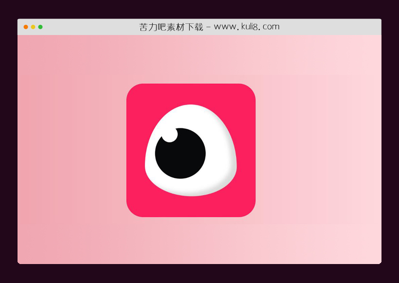

资源描述:一款模拟眨眼动画效果,CSS动画操纵眼睛以模仿眨眼。
纯CSS实现的逼真眨眼动画特效代码(共2个文件)
- index.html
使用方法
.box {
  display: flex;
  align-items: center;
  justify-content: center;
  transition: box-shadow 0.2s ease-in-out;
  display: flex;
  flex-direction: column;
  justify-content: center;
  transition: opacity 0.15s ease-in;
  background-color: #fc205e;
  height: 100%;
  width: 100%;
  margin: auto;
  margin-top: 2rem;
  width: 287px;
  height: 300px;
  padding: 3rem;
  border-radius: 50px;
}
.box .eyeContainer {
  display: flex;
  width: 80%;
  /* margin-top: 6rem; */
  justify-content: center;
}
.box .eyeContainer .eyeLid {
  text-align: center;
  display: flex;
  background-color: white;
  border-radius: 50% 50% 49% 51%/67% 68% 32% 33%;
  box-shadow: inset -17px -10px 12.5px rgba(0, 0, 0, 0.144);
  -webkit-animation-name: blink;
  -webkit-animation-duration: 15s;
  -webkit-animation-iteration-count: infinite;
  -webkit-transform-origin: 50%;
  animation-play-state: running;
}
.box:hover {
  cursor: help;
}

.eyeLid,
.eyes {
  text-align: center;
  display: flex;
  /* font-size: 0.65em; */
  width: 17rem;
  height: 17rem;
  /* background-color: black; */
}

.eye {
  position: relative;
  display: inline-block;
  border-radius: 50%;
  width: 55%;
  height: 55%;
  background-color: #08090a;
  border-radius: 50%;
  z-index: 8976;
  margin: auto;
  margin-left: 30px;
  margin-top: 70px;
  -webkit-animation-name: eyeball;
  -webkit-animation-duration: 15s;
  -webkit-animation-iteration-count: infinite;
  -webkit-transform-origin: 30%;
  animation-play-state: running;
}
.eye:after {
  /*pupil*/
  --pupil-size: 2rem;
  position: absolute;
  top: -0.4rem;
  left: 1.2rem;
  width: 3rem;
  height: 3rem;
  background: white;
  border-radius: 50%;
  content: " ";
}

@keyframes blink {
  0% {
    -webkit-transform: scaleX(1) scaleY(1);
  }
  10% {
    -webkit-transform: scaleX(1) scaleY(1);
  }
  10.5% {
    -webkit-transform: scaleX(1.3) scaleY(0.1);
  }
  11% {
    -webkit-transform: scaleX(1) scaleY(1);
  }
  40% {
    -webkit-transform: scaleX(1) scaleY(1);
  }
  40.5% {
    -webkit-transform: scaleX(1.3) scaleY(0.1);
  }
  41% {
    -webkit-transform: scaleX(1) scaleY(1);
  }
  70% {
    -webkit-transform: scaleX(1) scaleY(1);
  }
  70.5% {
    -webkit-transform: scaleX(1.3) scaleY(0.1);
  }
  71% {
    -webkit-transform: scaleX(1) scaleY(1);
  }
  100% {
    -webkit-transform: scaleX(1) scaleY(1);
  }
}
@keyframes eyeball {
  0% {
    -webkit-transform: scaleX(1) scaleY(1);
    margin-left: 30px;
    margin-top: 70px;
  }
  10% {
    -webkit-transform: scaleX(1) scaleY(1);
    margin-left: 30px;
    margin-top: 70px;
  }
  10.5% {
    -webkit-transform: scaleX(1.3) scaleY(0.1);
    margin-left: 30px;
    margin-top: 64px;
  }
  11% {
    -webkit-transform: scaleX(1) scaleY(1);
    margin-left: 30px;
    margin-top: 70px;
  }
  40% {
    -webkit-transform: scaleX(1) scaleY(1);
    margin-left: 30px;
    margin-top: 70px;
  }
  40.5% {
    -webkit-transform: scaleX(1.3) scaleY(0.1);
    margin-left: 78px;
    margin-top: 58px;
  }
  41% {
    -webkit-transform: scaleX(1) scaleY(1);
    margin-left: 78px;
    margin-top: 62px;
  }
  70% {
    -webkit-transform: scaleX(1) scaleY(1);
    margin-left: 78px;
    margin-top: 62px;
  }
  70.5% {
    -webkit-transform: scaleX(1.3) scaleY(0.1);
    margin-left: 30px;
    margin-top: 68px;
  }
  71% {
    -webkit-transform: scaleX(1) scaleY(1);
    margin-left: 30px;
    margin-top: 70px;
  }
  100% {
    -webkit-transform: scaleX(1) scaleY(1);
    margin-left: 30px;
    margin-top: 70px;
  }
}
站长提示:
1. 苦力吧素材官方QQ群:950875342
2. 平台上所有素材资源,需注册登录会员方能正常下载。
3. 会员用户积极反馈网站、素材资源BUG或错误问题,每次奖励2K币。
4. PHP源码类素材,如需协助安装调试,或你有二次开发需求,可联系苦力吧客服。
5. 付费素材资源,需充值后方能下载,如有任何疑问可直接联系苦力吧客服
1. 苦力吧素材官方QQ群:950875342
2. 平台上所有素材资源,需注册登录会员方能正常下载。
3. 会员用户积极反馈网站、素材资源BUG或错误问题,每次奖励2K币。
4. PHP源码类素材,如需协助安装调试,或你有二次开发需求,可联系苦力吧客服。
5. 付费素材资源,需充值后方能下载,如有任何疑问可直接联系苦力吧客服
PREVIOUS:
NEXT:
相关资源 / 动画效果

😀
- 😀
- 😊
- 😂
- 😍
- 😑
- 😷
- 😵
- 😛
- 😣
- 😱
- 😋
- 😎
- 😵
- 😕
- 😶
- 😚
- 😜
- 😭
发表评论