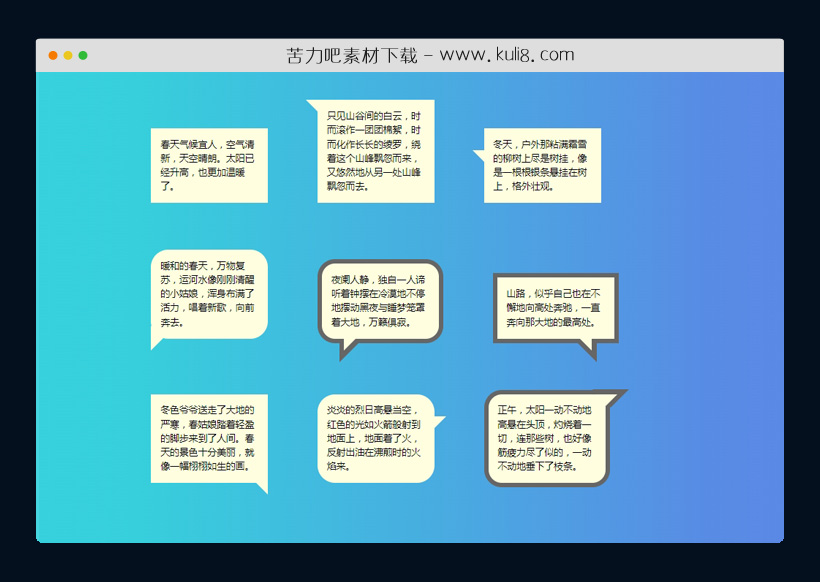

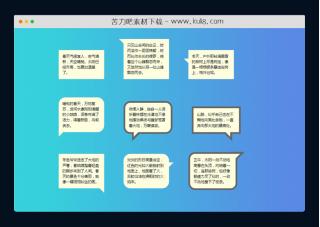
资源描述:这是一款聊天消息气泡模板,在不同位置设置各种形状的语音气泡样式,包括正方形、椭圆和三角形,通常都运用在聊天对话或者群聊当中,非常好看。
9种不同的CSS聊天消息语音气泡特效代码(共2个文件)
- index.html
使用方法
.cd__main{
   background: linear-gradient(to right, #36d1dc, #5b86e5) !important;
}

/* General CSS Setup */
body{
  background-color: lightblue;
  font-family: "Ubuntu-Italic", "Lucida Sans", helvetica, sans;
}

/* container */
.container {
  padding: 5% 5%;
}

/* CSS talk bubble */
.talk-bubble {
	margin: 40px;
  display: inline-block;
  position: relative;
	width: 200px;
	height: auto;
	background-color: lightyellow;
}
.border{
  border: 8px solid #666;
}
.round{
  border-radius: 30px;
	-webkit-border-radius: 30px;
	-moz-border-radius: 30px;

}

/* Right triangle placed top left flush. */
.tri-right.border.left-top:before {
	content: ' ';
	position: absolute;
	width: 0;
	height: 0;
  left: -40px;
	right: auto;
  top: -8px;
	bottom: auto;
	border: 32px solid;
	border-color: #666 transparent transparent transparent;
}
.tri-right.left-top:after{
	content: ' ';
	position: absolute;
	width: 0;
	height: 0;
  left: -20px;
	right: auto;
  top: 0px;
	bottom: auto;
	border: 22px solid;
	border-color: lightyellow transparent transparent transparent;
}

/* Right triangle, left side slightly down */
.tri-right.border.left-in:before {
	content: ' ';
	position: absolute;
	width: 0;
	height: 0;
  left: -40px;
	right: auto;
  top: 30px;
	bottom: auto;
	border: 20px solid;
	border-color: #666 #666 transparent transparent;
}
.tri-right.left-in:after{
	content: ' ';
	position: absolute;
	width: 0;
	height: 0;
  left: -20px;
	right: auto;
  top: 38px;
	bottom: auto;
	border: 12px solid;
	border-color: lightyellow lightyellow transparent transparent;
}

/*Right triangle, placed bottom left side slightly in*/
.tri-right.border.btm-left:before {
	content: ' ';
	position: absolute;
	width: 0;
	height: 0;
	left: -8px;
  right: auto;
  top: auto;
	bottom: -40px;
	border: 32px solid;
	border-color: transparent transparent transparent #666;
}
.tri-right.btm-left:after{
	content: ' ';
	position: absolute;
	width: 0;
	height: 0;
	left: 0px;
  right: auto;
  top: auto;
	bottom: -20px;
	border: 22px solid;
	border-color: transparent transparent transparent lightyellow;
}

/*Right triangle, placed bottom left side slightly in*/
.tri-right.border.btm-left-in:before {
	content: ' ';
	position: absolute;
	width: 0;
	height: 0;
	left: 30px;
  right: auto;
  top: auto;
	bottom: -40px;
	border: 20px solid;
	border-color: #666 transparent transparent #666;
}
.tri-right.btm-left-in:after{
	content: ' ';
	position: absolute;
	width: 0;
	height: 0;
	left: 38px;
  right: auto;
  top: auto;
	bottom: -20px;
	border: 12px solid;
	border-color: lightyellow transparent transparent lightyellow;
}

/*Right triangle, placed bottom right side slightly in*/
.tri-right.border.btm-right-in:before {
	content: ' ';
	position: absolute;
	width: 0;
	height: 0;
  left: auto;
	right: 30px;
	bottom: -40px;
	border: 20px solid;
	border-color: #666 #666 transparent transparent;
}
.tri-right.btm-right-in:after{
	content: ' ';
	position: absolute;
	width: 0;
	height: 0;
  left: auto;
	right: 38px;
	bottom: -20px;
	border: 12px solid;
	border-color: lightyellow lightyellow transparent transparent;
}
/*
	left: -8px;
  right: auto;
  top: auto;
	bottom: -40px;
	border: 32px solid;
	border-color: transparent transparent transparent #666;
	left: 0px;
  right: auto;
  top: auto;
	bottom: -20px;
	border: 22px solid;
	border-color: transparent transparent transparent lightyellow;

/*Right triangle, placed bottom right side slightly in*/
.tri-right.border.btm-right:before {
	content: ' ';
	position: absolute;
	width: 0;
	height: 0;
  left: auto;
	right: -8px;
	bottom: -40px;
	border: 20px solid;
	border-color: #666 #666 transparent transparent;
}
.tri-right.btm-right:after{
	content: ' ';
	position: absolute;
	width: 0;
	height: 0;
  left: auto;
	right: 0px;
	bottom: -20px;
	border: 12px solid;
	border-color: lightyellow lightyellow transparent transparent;
}

/* Right triangle, right side slightly down*/
.tri-right.border.right-in:before {
	content: ' ';
	position: absolute;
	width: 0;
	height: 0;
  left: auto;
	right: -40px;
  top: 30px;
	bottom: auto;
	border: 20px solid;
	border-color: #666 transparent transparent #666;
}
.tri-right.right-in:after{
	content: ' ';
	position: absolute;
	width: 0;
	height: 0;
  left: auto;
	right: -20px;
  top: 38px;
	bottom: auto;
	border: 12px solid;
	border-color: lightyellow transparent transparent lightyellow;
}

/* Right triangle placed top right flush. */
.tri-right.border.right-top:before {
	content: ' ';
	position: absolute;
	width: 0;
	height: 0;
  left: auto;
	right: -40px;
  top: -8px;
	bottom: auto;
	border: 32px solid;
	border-color: #666 transparent transparent transparent;
}
.tri-right.right-top:after{
	content: ' ';
	position: absolute;
	width: 0;
	height: 0;
  left: auto;
	right: -20px;
  top: 0px;
	bottom: auto;
	border: 20px solid;
	border-color: lightyellow transparent transparent transparent;
}

/* talk bubble contents */
.talktext{
  padding: 1em;
	text-align: left;
  line-height: 1.5em;
}
.talktext p{
  /* remove webkit p margins */
  -webkit-margin-before: 0em;
  -webkit-margin-after: 0em;
}
站长提示:
1. 苦力吧素材官方QQ群:950875342
2. 平台上所有素材资源,需注册登录会员方能正常下载。
3. 会员用户积极反馈网站、素材资源BUG或错误问题,每次奖励2K币。
4. PHP源码类素材,如需协助安装调试,或你有二次开发需求,可联系苦力吧客服。
5. 付费素材资源,需充值后方能下载,如有任何疑问可直接联系苦力吧客服
1. 苦力吧素材官方QQ群:950875342
2. 平台上所有素材资源,需注册登录会员方能正常下载。
3. 会员用户积极反馈网站、素材资源BUG或错误问题,每次奖励2K币。
4. PHP源码类素材,如需协助安装调试,或你有二次开发需求,可联系苦力吧客服。
5. 付费素材资源,需充值后方能下载,如有任何疑问可直接联系苦力吧客服
PREVIOUS:
NEXT:
相关资源 / 其它&杂项
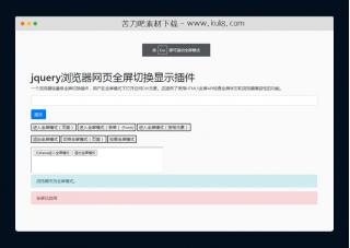
jquery浏览器网页全屏切换显示插件
一个浏览器轻量级全屏切换插件,用户在全屏模式下打开任何DIV元素,还支持嵌套iframe框架操作。 还提供了使用HTML5全屏API检查全屏状态和浏览器兼容性的功能。
其它&杂项

评论数(3) 回复有机会获得K币 用户协议


😀
- 😀
- 😊
- 😂
- 😍
- 😑
- 😷
- 😵
- 😛
- 😣
- 😱
- 😋
- 😎
- 😵
- 😕
- 😶
- 😚
- 😜
- 😭
发表评论