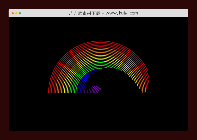

资源描述:一款七色彩虹动画效果,使用了CSS3关键帧以圆形模式旋转,采用了7中不同颜色线条。
CSS3七色动感的彩虹动画特效代码(共2个文件)
- index.html
使用方法
* {
    margin:0;
    padding:0;
}
@media (max-width:425px){
    .team .cap {
        transform:scale(0.9);
    }
}
.team {
    width:100vw;
    height:100vh;
    background-color:#000;
    display:flex;
    justify-content:center;
    align-items:center;
}
.team .cap {
    width:450px;
    height:450px;
    background-color:transparent;
    display:flex;
    justify-content:center;
    align-items:center;
}
.team .cap .cvr {
    width:450px;
    height:225px;
    background-color:#000;
    z-index:99;
    position:relative;
    top:112px;
}
.team .cap .c0 {
    position:absolute;
    background-color:transparent;
    border-radius:50%;
    border-width:2.5px;
    border-style:solid;
    border-color:transparent;
    transform:rotateZ(135deg);
}
.team .cap .c1 {
    width:25px;
    height:25px;
    border-top-color:#9400D3;
    border-right-color:#9400D3;
    animation:spin 2s ease-out 3.5s infinite alternate;
}
.team .cap .c2 {
    width:37px;
    height:37px;
    border-top-color:#9400D3;
    border-right-color:#9400D3;
    animation:spin 2s ease-out 3.4s infinite alternate;
}
.team .cap .c3 {
    width:49px;
    height:49px;
    border-top-color:#9400D3;
    border-right-color:#9400D3;
    animation:spin 2s ease-out 3.3s infinite alternate;
}
.team .cap .c4 {
    width:61px;
    height:61px;
    border-top-color:#9400D3;
    border-right-color:#9400D3;
    animation:spin 2s ease-out 3.2s infinite alternate;
}
.team .cap .c5 {
    width:73px;
    height:73px;
    border-top-color:#9400D3;
    border-right-color:#9400D3;
    animation:spin 2s ease-out 3.1s infinite alternate;
}
.team .cap .c6 {
    width:85px;
    height:85px;
    border-top-color:#4B0082;
    border-right-color:#4B0082;
    animation:spin 2s ease-out 3s infinite alternate;
}
.team .cap .c7 {
    width:97px;
    height:97px;
    border-top-color:#4B0082;
    border-right-color:#4B0082;
    animation:spin 2s ease-out 2.9s infinite alternate;
}
.team .cap .c8 {
    width:109px;
    height:109px;
    border-top-color:#4B0082;
    border-right-color:#4B0082;
    animation:spin 2s ease-out 2.8s infinite alternate;
}
.team .cap .c9 {
    width:121px;
    height:121px;
    border-top-color:#4B0082;
    border-right-color:#4B0082;
    animation:spin 2s ease-out 2.7s infinite alternate;
}
.team .cap .c10 {
    width:132px;
    height:132px;
    border-top-color:#4B0082;
    border-right-color:#4B0082;
    animation:spin 2s ease-out 2.6s infinite alternate;
}
.team .cap .c11 {
    width:144px;
    height:144px;
    border-top-color:#0000FF;
    border-right-color:#0000FF;
    animation:spin 2s ease-out 2.5s infinite alternate;
}
.team .cap .c12 {
    width:156px;
    height:156px;
    border-top-color:#0000FF;
    border-right-color:#0000FF;
    animation:spin 2s ease-out 2.4s infinite alternate;
}
.team .cap .c13 {
    width:168px;
    height:168px;
    border-top-color:#0000FF;
    border-right-color:#0000FF;
    animation:spin 2s ease-out 2.3s infinite alternate;
}
.team .cap .c14 {
    width:180px;
    height:180px;
    border-top-color:#0000FF;
    border-right-color:#0000FF;
    animation:spin 2s ease-out 2.2s infinite alternate;
}
.team .cap .c15 {
    width:192px;
    height:192px;
    border-top-color:#0000FF;
    border-right-color:#0000FF;
    animation:spin 2s ease-out 2.1s infinite alternate;
}
.team .cap .c16 {
    width:204px;
    height:204px;
    border-top-color:#00FF00;
    border-right-color:#00FF00;
    animation:spin 2s ease-out 2s infinite alternate;
}
.team .cap .c17 {
    width:216px;
    height:216px;
    border-top-color:#00FF00;
    border-right-color:#00FF00;
    animation:spin 2s ease-out 1.9s infinite alternate;
}
.team .cap .c18 {
    width:228px;
    height:228px;
    border-top-color:#00FF00;
    border-right-color:#00FF00;
    animation:spin 2s ease-out 1.8s infinite alternate;
}
.team .cap .c19 {
    width:240px;
    height:240px;
    border-top-color:#00FF00;
    border-right-color:#00FF00;
    animation:spin 2s ease-out 1.7s infinite alternate;
}
.team .cap .c20 {
    width:252px;
    height:252px;
    border-top-color:#00FF00;
    border-right-color:#00FF00;
    animation:spin 2s ease-out 1.6s infinite alternate;
}
.team .cap .c21 {
    width:264px;
    height:264px;
    border-top-color:#FFFF00;
    border-right-color:#FFFF00;
    animation:spin 2s ease-out 1.5s infinite alternate;
}
.team .cap .c22 {
    width:276px;
    height:276px;
    border-top-color:#FFFF00;
    border-right-color:#FFFF00;
    animation:spin 2s ease-out 1.4s infinite alternate;
}
.team .cap .c23 {
    width:288px;
    height:288px;
    border-top-color:#FFFF00;
    border-right-color:#FFFF00;
    animation:spin 2s ease-out 1.3s infinite alternate;
}
.team .cap .c24 {
    width:300px;
    height:300px;
    border-top-color:#FFFF00;
    border-right-color:#FFFF00;
    animation:spin 2s ease-out 1.2s infinite alternate;
}
.team .cap .c25 {
    width:312px;
    height:312px;
    border-top-color:#FFFF00;
    border-right-color:#FFFF00;
    animation:spin 2s ease-out 1.1s infinite alternate;
}
.team .cap .c26 {
    width:324px;
    height:324px;
    border-top-color:#FF7F00;
    border-right-color:#FF7F00;
    animation:spin 2s ease-out 1s infinite alternate;
}
.team .cap .c27 {
    width:336px;
    height:336px;
    border-top-color:#FF7F00;
    border-right-color:#FF7F00;
    animation:spin 2s ease-out 0.9s infinite alternate;
}
.team .cap .c28 {
    width:348px;
    height:348px;
    border-top-color:#FF7F00;
    border-right-color:#FF7F00;
    animation:spin 2s ease-out 0.8s infinite alternate;
}
.team .cap .c29 {
    width:360px;
    height:360px;
    border-top-color:#FF7F00;
    border-right-color:#FF7F00;
    animation:spin 2s ease-out 0.7s infinite alternate;
}
.team .cap .c30 {
    width:372px;
    height:372px;
    border-top-color:#FF7F00;
    border-right-color:#FF7F00;
    animation:spin 2s ease-out 0.6s infinite alternate;
}
.team .cap .c31 {
    width:384px;
    height:384px;
    border-top-color:#FF0000;
    border-right-color:#FF0000;
    animation:spin 2s ease-out 0.5s infinite alternate;
}
.team .cap .c32 {
    width:396px;
    height:396px;
    border-top-color:#FF0000;
    border-right-color:#FF0000;
    animation:spin 2s ease-out 0.4s infinite alternate;
}
.team .cap .c33 {
    width:408px;
    height:408px;
    border-top-color:#FF0000;
    border-right-color:#FF0000;
    animation:spin 2s ease-out 0.3s infinite alternate;
}
.team .cap .c34 {
    width:420px;
    height:420px;
    border-top-color:#FF0000;
    border-right-color:#FF0000;
    animation:spin 2s ease-out 0.2s infinite alternate;
}
.team .cap .c35 {
    width:432px;
    height:432px;
    border-top-color:#FF0000;
    border-right-color:#FF0000;
    animation:spin 2s ease-out 0.1s infinite alternate;
}
@keyframes spin {
    0% {transform:rotateZ(135deg);}
    100% {transform:rotateZ(315deg);}
}
站长提示:
1. 苦力吧素材官方QQ群:950875342
2. 平台上所有素材资源,需注册登录会员方能正常下载。
3. 会员用户积极反馈网站、素材资源BUG或错误问题,每次奖励2K币。
4. PHP源码类素材,如需协助安装调试,或你有二次开发需求,可联系苦力吧客服。
5. 付费素材资源,需充值后方能下载,如有任何疑问可直接联系苦力吧客服
1. 苦力吧素材官方QQ群:950875342
2. 平台上所有素材资源,需注册登录会员方能正常下载。
3. 会员用户积极反馈网站、素材资源BUG或错误问题,每次奖励2K币。
4. PHP源码类素材,如需协助安装调试,或你有二次开发需求,可联系苦力吧客服。
5. 付费素材资源,需充值后方能下载,如有任何疑问可直接联系苦力吧客服
PREVIOUS:
NEXT:
相关资源 / 动画效果


评论数(2) 回复有机会获得K币 用户协议


😀
- 😀
- 😊
- 😂
- 😍
- 😑
- 😷
- 😵
- 😛
- 😣
- 😱
- 😋
- 😎
- 😵
- 😕
- 😶
- 😚
- 😜
- 😭
发表评论