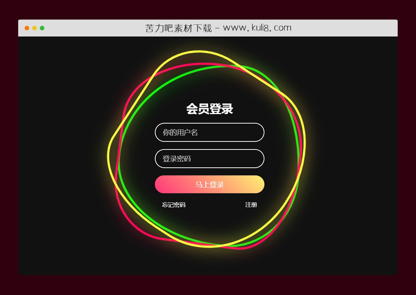

资源描述:一款多彩纽带背景动画特效代码,多个不规则绳子循环旋转,而且鼠标悬停变色发光,该表单包含字段:用户名、密码字段和登录按钮。
一款带CSS3多彩纽带动画的登录表单特效(共2个文件)
- index.html
使用方法
body {

  display: flex;
  justify-content: center;
  align-items: center;
  min-height: 100vh;
  background: #111;
  width: 100%;
  overflow: hidden;
}
.ring {
  position: relative;
  width: 500px;
  height: 500px;
  display: flex;
  justify-content: center;
  align-items: center;
  top: 120px;
}
.ring i {
  position: absolute;
  inset: 0;
  border: 2px solid #fff;
  transition: 0.5s;
}
.ring i:nth-child(1) {
  border-radius: 38% 62% 63% 37% / 41% 44% 56% 59%;
  animation: animate 6s linear infinite;
}
.ring i:nth-child(2) {
  border-radius: 41% 44% 56% 59%/38% 62% 63% 37%;
  animation: animate 4s linear infinite;
}
.ring i:nth-child(3) {
  border-radius: 41% 44% 56% 59%/38% 62% 63% 37%;
  animation: animate2 10s linear infinite;
}
.ring:hover i {
  border: 6px solid var(--clr);
  filter: drop-shadow(0 0 20px var(--clr));
}
@keyframes animate {
  0% {
    transform: rotate(0deg);
  }
  100% {
    transform: rotate(360deg);
  }
}
@keyframes animate2 {
  0% {
    transform: rotate(360deg);
  }
  100% {
    transform: rotate(0deg);
  }
}
.login {
  position: absolute;
  width: 300px;
  height: 100%;
  display: flex;
  justify-content: center;
  align-items: center;
  flex-direction: column;
  gap: 20px;
}
.login h2 {
  font-size: 2em;
  color: #fff;
}
.login .inputBx {
  position: relative;
  width: 100%;
}
.login .inputBx input {
  position: relative;
  width: 100%;
  padding: 12px 20px;
  background: transparent;
  border: 2px solid #fff;
  border-radius: 40px;
  font-size: 1.2em;
  color: #fff;
  box-shadow: none;
  outline: none;
}
.login .inputBx input[type="submit"] {
  width: 100%;
  background: #0078ff;
  background: linear-gradient(45deg, #ff357a, #fff172);
  border: none;
  cursor: pointer;
}
.login .inputBx input::placeholder {
  color: rgba(255, 255, 255, 0.75);
}
.login .links {
  position: relative;
  width: 100%;
  display: flex;
  align-items: center;
  justify-content: space-between;
  padding: 0 20px;
}
.login .links a {
  color: #fff;
  text-decoration: none;
}
站长提示:
1. 苦力吧素材官方QQ群:950875342
2. 平台上所有素材资源,需注册登录会员方能正常下载。
3. 会员用户积极反馈网站、素材资源BUG或错误问题,每次奖励2K币。
4. PHP源码类素材,如需协助安装调试,或你有二次开发需求,可联系苦力吧客服。
5. 付费素材资源,需充值后方能下载,如有任何疑问可直接联系苦力吧客服
1. 苦力吧素材官方QQ群:950875342
2. 平台上所有素材资源,需注册登录会员方能正常下载。
3. 会员用户积极反馈网站、素材资源BUG或错误问题,每次奖励2K币。
4. PHP源码类素材,如需协助安装调试,或你有二次开发需求,可联系苦力吧客服。
5. 付费素材资源,需充值后方能下载,如有任何疑问可直接联系苦力吧客服
PREVIOUS:
NEXT:
相关资源 / 动画效果


😀
- 😀
- 😊
- 😂
- 😍
- 😑
- 😷
- 😵
- 😛
- 😣
- 😱
- 😋
- 😎
- 😵
- 😕
- 😶
- 😚
- 😜
- 😭
发表评论