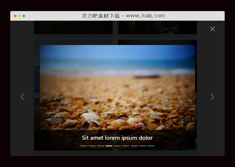

资源描述:一款图片弹出层插件,点击缩略图即可弹出图片大图弹出层,可进行左右切换上一张或下一张图片,弹出层图片带有缓慢放大动画效果。
bootstrap带有左右切换及放大动画的响应式图片弹出层(共3个文件)
- index.html
使用方法
const html = document.querySelector('html');
html.setAttribute('data-bs-theme', 'dark');

const galleryGrid = document.querySelector(".gallery-grid");
const links = galleryGrid.querySelectorAll("a");
const imgs = galleryGrid.querySelectorAll("img");
const lightboxModal = document.getElementById("lightbox-modal");
const bsModal = new bootstrap.Modal(lightboxModal);
const modalBody = lightboxModal.querySelector(".lightbox-content");

function createCaption (caption) {
  return `<div class="carousel-caption d-none d-md-block">
      <h4 class="m-0">${caption}</h4>
    </div>`;
}

function createIndicators (img) {
  let markup = "", i, len;

  const countSlides = links.length;
  const parentCol = img.closest('.col');
  const curIndex = [...parentCol.parentElement.children].indexOf(parentCol);

  for (i = 0, len = countSlides; i < len; i++) {
    markup += `
      <button type="button" data-bs-target="#lightboxCarousel"
        data-bs-slide-to="${i}"
        ${i === curIndex ? 'class="active" aria-current="true"' : ''}
        aria-label="Slide ${i + 1}">
      </button>`;
  }

  return markup;
}

function createSlides (img) {
  let markup = "";
  const currentImgSrc = img.closest('.gallery-item').getAttribute("href");

  for (const img of imgs) {
    const imgSrc = img.closest('.gallery-item').getAttribute("href");
    const imgAlt = img.getAttribute("alt");

    markup += `
      <div class="carousel-item${currentImgSrc === imgSrc ? " active" : ""}">
        <img class="d-block img-fluid w-100" src=${imgSrc} alt="${imgAlt}">
        ${imgAlt ? createCaption(imgAlt) : ""}
      </div>`;
  }

  return markup;
}

function createCarousel (img) {
  const markup = `
    <!-- Lightbox Carousel -->
    <div id="lightboxCarousel" class="carousel slide carousel-fade" data-bs-ride="true">
      <!-- Indicators/dots -->
      <div class="carousel-indicators">
        ${createIndicators(img)}
      </div>
      <!-- Wrapper for Slides -->
      <div class="carousel-inner justify-content-center mx-auto">
        ${createSlides(img)}
      </div>
      <!-- Controls/icons -->
      <button class="carousel-control-prev" type="button" data-bs-target="#lightboxCarousel" data-bs-slide="prev">
        <span class="carousel-control-prev-icon" aria-hidden="true"></span>
        <span class="visually-hidden">Previous</span>
      </button>
      <button class="carousel-control-next" type="button" data-bs-target="#lightboxCarousel" data-bs-slide="next">
        <span class="carousel-control-next-icon" aria-hidden="true"></span>
        <span class="visually-hidden">Next</span>
      </button>
    </div>
    `;

  modalBody.innerHTML = markup;
}

for (const link of links) {
  link.addEventListener("click", function (e) {
    e.preventDefault();
    const currentImg = link.querySelector("img");
    const lightboxCarousel = document.getElementById("lightboxCarousel");

    if (lightboxCarousel) {
      const parentCol = link.closest('.col');
      const index = [...parentCol.parentElement.children].indexOf(parentCol);

      const bsCarousel = new bootstrap.Carousel(lightboxCarousel);
      bsCarousel.to(index);
    } else {
      createCarousel(currentImg);
    }

    bsModal.show();
  });
}
站长提示:
1. 苦力吧素材官方QQ群:950875342
2. 平台上所有素材资源,需注册登录会员方能正常下载。
3. 会员用户积极反馈网站、素材资源BUG或错误问题,每次奖励2K币。
4. PHP源码类素材,如需协助安装调试,或你有二次开发需求,可联系苦力吧客服。
5. 付费素材资源,需充值后方能下载,如有任何疑问可直接联系苦力吧客服
1. 苦力吧素材官方QQ群:950875342
2. 平台上所有素材资源,需注册登录会员方能正常下载。
3. 会员用户积极反馈网站、素材资源BUG或错误问题,每次奖励2K币。
4. PHP源码类素材,如需协助安装调试,或你有二次开发需求,可联系苦力吧客服。
5. 付费素材资源,需充值后方能下载,如有任何疑问可直接联系苦力吧客服
PREVIOUS:
NEXT:
相关资源 / 弹出层


😀
- 😀
- 😊
- 😂
- 😍
- 😑
- 😷
- 😵
- 😛
- 😣
- 😱
- 😋
- 😎
- 😵
- 😕
- 😶
- 😚
- 😜
- 😭
发表评论