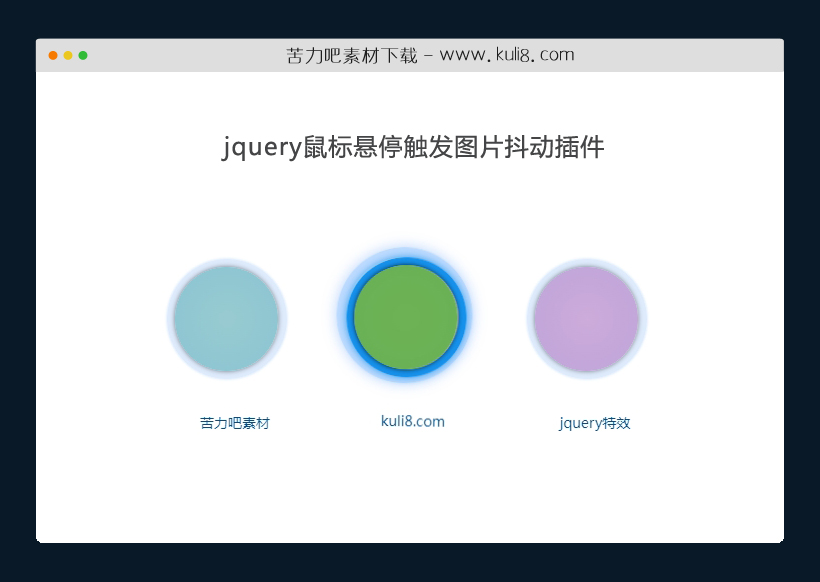

资源描述:一款简单的图片抖动动画,将鼠标悬停滑过图片上时,图片会产生一系列抖动动画。
jquery鼠标悬停触发图片抖动插件(共10个文件)
- index.html
使用方法
$.fn.extend({ShakeBorder: function(opciones) {
					var ShakeBorder=this;
					theClassShake=$(ShakeBorder).attr('class');


					defaults = {shake:true,border:true}
					var opciones = $.extend({}, defaults, opciones);

					if(opciones.shake){
						shakecode ='<style>@-webkit-keyframes spaceboots {0%   { -webkit-transform: translate(2px, 1px)   rotate(0deg); }10%  { -webkit-transform: translate(-1px, -2px) rotate(-1deg); }	20%  { -webkit-transform: translate(-3px, 0px)  rotate(1deg); }';
						shakecode=shakecode+'30%  { -webkit-transform: translate(0px, 2px)   rotate(0deg); }';
						shakecode=shakecode+'40%  { -webkit-transform: translate(1px, -1px)  rotate(1deg); }';
						shakecode=shakecode+'50%  { -webkit-transform: translate(-1px, 1px)  rotate(-1deg); }';
						shakecode=shakecode+'60%  { -webkit-transform: translate(-3px, -2px)  rotate(0deg); }';
						shakecode=shakecode+'70%  { -webkit-transform: translate(2px, 1px)   rotate(-1deg); }';
						shakecode=shakecode+'80%  { -webkit-transform: translate(-1px, -2px) rotate(1deg); }';
						shakecode=shakecode+'90%  { -webkit-transform: translate(2px, -1px)   rotate(0deg); }';
						shakecode=shakecode+'100% { -webkit-transform: translate(1px, -2px)  rotate(-1deg); }}';
						shakecode=shakecode+"."+theClassShake+":hover,."+theClassShake+":focus,."+theClassShake+":hover,."+theClassShake+":focus {-webkit-animation-name: 'spaceboots';-webkit-animation-duration: 0.8s;-webkit-transform-origin:50% 50%;-webkit-animation-iteration-count: infinite;	-webkit-animation-timing-function: linear;}";
						shakecode=shakecode+'.'+theClassShake+' {display:block;	position:relative;}';
						shakecode=shakecode+'.'+theClassShake+'.inline {display:inline-block;}</style>';


						shakecode ='<style>.'+theClassShake+' {display:block;position:relative;}';
						shakecode=shakecode+'.'+theClassShake+':hover {-webkit-animation-name: shakeEffect;';
						shakecode=shakecode+'-moz-animation-name: shakeEffect;';
						shakecode=shakecode+'animation-name: shakeEffect;';
						shakecode=shakecode+'-webkit-animation-duration: 0.8s;';
						shakecode=shakecode+'-moz-animation-duration: 0.8s;'
						shakecode=shakecode+'animation-duration: 0.8s;';
						shakecode=shakecode+'-webkit-transform-origin:50% 50%;';
						shakecode=shakecode+'-moz-transform-origin:50% 50%;';
			shakecode=shakecode+'transform-origin:50% 50%;';
			shakecode=shakecode+'-webkit-animation-iteration-count: infinite;';
			shakecode=shakecode+'-moz-animation-iteration-count: infinite;';
			shakecode=shakecode+'animation-iteration-count: infinite;';
			shakecode=shakecode+'-webkit-animation-timing-function: linear;';
			shakecode=shakecode+'-moz-animation-timing-function: linear;';
			shakecode=shakecode+'animation-timing-function: linear;';
			shakecode=shakecode+'}';

shakecode=shakecode+theClassShake+'</style>';
			$(ShakeBorder).before(shakecode);
			}
				if(opciones.border){
						shakecode='';
						shakecode=shakecode+"<style>."+theClassShake+":hover img{opacity:1;filter: alpha(opacity = 100);}";
						shakecode=shakecode+"."+theClassShake+":hover .Ot1{border-color:#0088EA;box-shadow:0 0 10px #0285E2;}"
						shakecode=shakecode+"."+theClassShake+":hover .outer2{opacity:1;filter: alpha(opacity = 100);box-shadow:0 0 20px #8EB9FF;} </style>"
						$(ShakeBorder).before(shakecode);
				}
				$(ShakeBorder).each(function( index ) {
					thesrc=$(this).attr('src');
					attralt=$(this).attr('alt');
					alt='';
					if (typeof attralt !== typeof undefined && attralt !== false) {{ alt=attralt; }}
					var theCode='';
					theCode=theCode+'<div class=" HoverShakeImage '+theClassShake+'">';
					theCode=theCode+'<div class="Ot1 crclu"></div>';
					theCode=theCode+'<div class="outer2 crclu"></div>';
					theCode=theCode+'<figure>';
					theCode=theCode+'<img src="'+thesrc+'" />';
					theCode=theCode+'<figcaption class="caption">'+alt+'</figcaption>';
					theCode=theCode+'</figure>';
					theCode=theCode+'</div>';
					$(this).replaceWith( theCode );
				});
	}
});
站长提示:
1. 苦力吧素材官方QQ群:950875342
2. 平台上所有素材资源,需注册登录会员方能正常下载。
3. 会员用户积极反馈网站、素材资源BUG或错误问题,每次奖励2K币。
4. PHP源码类素材,如需协助安装调试,或你有二次开发需求,可联系苦力吧客服。
5. 付费素材资源,需充值后方能下载,如有任何疑问可直接联系苦力吧客服
1. 苦力吧素材官方QQ群:950875342
2. 平台上所有素材资源,需注册登录会员方能正常下载。
3. 会员用户积极反馈网站、素材资源BUG或错误问题,每次奖励2K币。
4. PHP源码类素材,如需协助安装调试,或你有二次开发需求,可联系苦力吧客服。
5. 付费素材资源,需充值后方能下载,如有任何疑问可直接联系苦力吧客服
PREVIOUS:
NEXT:
相关资源 / 动画效果
😀
- 😀
- 😊
- 😂
- 😍
- 😑
- 😷
- 😵
- 😛
- 😣
- 😱
- 😋
- 😎
- 😵
- 😕
- 😶
- 😚
- 😜
- 😭
发表评论