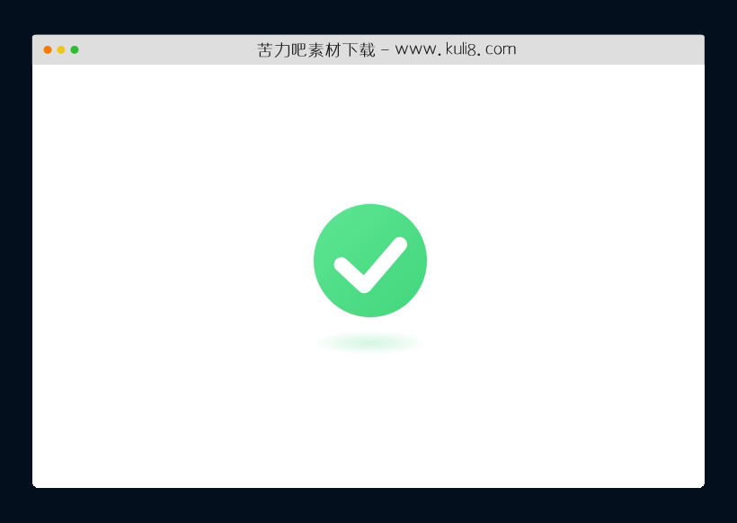

资源描述:一款绿色css成功提示按钮代码,绿色圆形里面打勾,下方设置了阴影效果。
纯CSS创建的成功提示按钮特效代码(共2个文件)
- index.html
使用方法
.main-container {
  width: 100%;
  height: 100vh;
  display: flex;
  flex-flow: column;
  justify-content: center;
  align-items: center;
}

.check-container {
  width: 6.25rem;
  height: 7.5rem;
  display: flex;
  flex-flow: column;
  align-items: center;
  justify-content: space-between;
}
.check-container .check-background {
  width: 100%;
  height: calc(100% - 1.25rem);
  background: linear-gradient(to bottom right, #5de593, #41d67c);
  box-shadow: 0px 0px 0px 65px rgba(255, 255, 255, 0.25) inset, 0px 0px 0px 65px rgba(255, 255, 255, 0.25) inset;
  transform: scale(0.84);
  border-radius: 50%;
  animation: animateContainer 0.75s ease-out forwards 0.75s;
  display: flex;
  align-items: center;
  justify-content: center;
  opacity: 0;
}
.check-container .check-background svg {
  width: 65%;
  transform: translateY(0.25rem);
  stroke-dasharray: 80;
  stroke-dashoffset: 80;
  animation: animateCheck 0.35s forwards 1.25s ease-out;
}
.check-container .check-shadow {
  bottom: calc(-15% - 5px);
  left: 0;
  border-radius: 50%;
  background: radial-gradient(closest-side, #49da83, transparent);
  animation: animateShadow 0.75s ease-out forwards 0.75s;
}

@keyframes animateContainer {
  0% {
    opacity: 0;
    transform: scale(0);
    box-shadow: 0px 0px 0px 65px rgba(255, 255, 255, 0.25) inset, 0px 0px 0px 65px rgba(255, 255, 255, 0.25) inset;
  }
  25% {
    opacity: 1;
    transform: scale(0.9);
    box-shadow: 0px 0px 0px 65px rgba(255, 255, 255, 0.25) inset, 0px 0px 0px 65px rgba(255, 255, 255, 0.25) inset;
  }
  43.75% {
    transform: scale(1.15);
    box-shadow: 0px 0px 0px 43.334px rgba(255, 255, 255, 0.25) inset, 0px 0px 0px 65px rgba(255, 255, 255, 0.25) inset;
  }
  62.5% {
    transform: scale(1);
    box-shadow: 0px 0px 0px 0px rgba(255, 255, 255, 0.25) inset, 0px 0px 0px 21.667px rgba(255, 255, 255, 0.25) inset;
  }
  81.25% {
    box-shadow: 0px 0px 0px 0px rgba(255, 255, 255, 0.25) inset, 0px 0px 0px 0px rgba(255, 255, 255, 0.25) inset;
  }
  100% {
    opacity: 1;
    box-shadow: 0px 0px 0px 0px rgba(255, 255, 255, 0.25) inset, 0px 0px 0px 0px rgba(255, 255, 255, 0.25) inset;
  }
}
@keyframes animateCheck {
  from {
    stroke-dashoffset: 80;
  }
  to {
    stroke-dashoffset: 0;
  }
}
@keyframes animateShadow {
  0% {
    opacity: 0;
    width: 100%;
    height: 15%;
  }
  25% {
    opacity: 0.25;
  }
  43.75% {
    width: 40%;
    height: 7%;
    opacity: 0.35;
  }
  100% {
    width: 85%;
    height: 15%;
    opacity: 0.25;
  }
}
站长提示:
1. 苦力吧素材官方QQ群:950875342
2. 平台上所有素材资源,需注册登录会员方能正常下载。
3. 会员用户积极反馈网站、素材资源BUG或错误问题,每次奖励2K币。
4. PHP源码类素材,如需协助安装调试,或你有二次开发需求,可联系苦力吧客服。
5. 付费素材资源,需充值后方能下载,如有任何疑问可直接联系苦力吧客服
1. 苦力吧素材官方QQ群:950875342
2. 平台上所有素材资源,需注册登录会员方能正常下载。
3. 会员用户积极反馈网站、素材资源BUG或错误问题,每次奖励2K币。
4. PHP源码类素材,如需协助安装调试,或你有二次开发需求,可联系苦力吧客服。
5. 付费素材资源,需充值后方能下载,如有任何疑问可直接联系苦力吧客服
PREVIOUS:
NEXT:
相关资源 / 表单美化
😀
- 😀
- 😊
- 😂
- 😍
- 😑
- 😷
- 😵
- 😛
- 😣
- 😱
- 😋
- 😎
- 😵
- 😕
- 😶
- 😚
- 😜
- 😭
发表评论