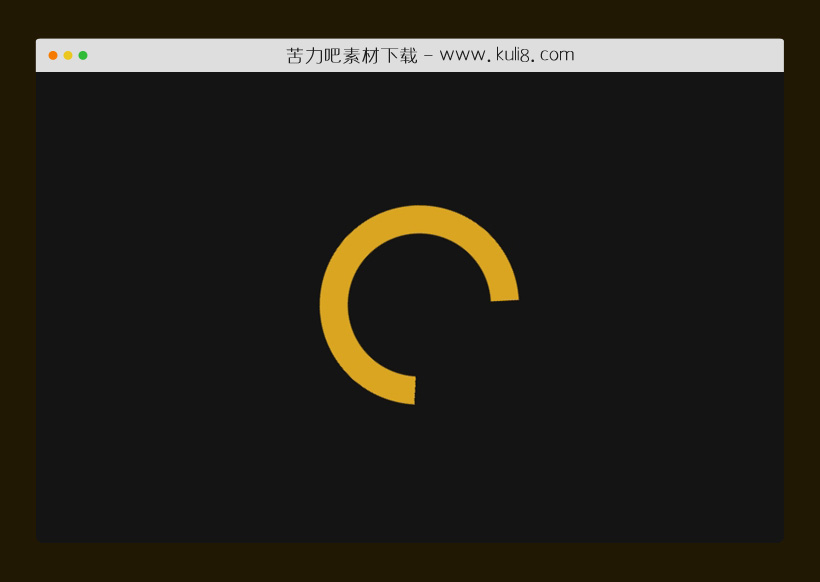

资源描述:这是一款CSS3加载动画,无限循环旋转动画。
CSS3创建的Circle Loader动画特效代码(共2个文件)
- index.html
使用方法
@property --nose {
  syntax: "<percentage>";
  initial-value: 0%;
  inherits: true;
}

@property --tail {
  syntax: "<percentage>";
  initial-value: 0%;
  inherits: true;
}

:root {
  --size: 25;
}
.cd__main{
   background: hsl(0, 0%, 8%) !important;
}

body {
  display: grid;
  place-items: center;
  min-height: 100vh;
  background: hsl(0, 0%, 8%);
}

.loader {
  height: calc(var(--size) * 1vmin);
  width: calc(var(--size) * 1vmin);
  position: relative;
  border-style: solid;
  border-width: 5vmin;
  border-color: transparent;
  border-radius: 50%;
  -webkit-mask: conic-gradient(
    from 45deg,
    transparent 0 var(--tail),
    white 0 var(--nose),
    transparent 0
  );
          mask: conic-gradient(
    from 45deg,
    transparent 0 var(--tail),
    white 0 var(--nose),
    transparent 0
  );
  -webkit-animation: load 2.5s both infinite ease-in-out, spin 3.25s infinite linear;
          animation: load 2.5s both infinite ease-in-out, spin 3.25s infinite linear;
}

.loader::after {
  content: "";
  position: absolute;
  inset: -5vmin;
  background: conic-gradient(
      from 95deg in hsl longer hue,
      hsl(240deg 100% 75%),
      hsl(240deg 100% 75%)
    ) -5vmin -5vmin / calc(100% + 10vmin) calc(100% + 10vmin);
  background: goldenrod;
  border-style: solid;
  border-width: 5vmin;
  border-color: transparent;
  border-radius: 50%;
  -webkit-mask: linear-gradient(white 0 0) padding-box,
    linear-gradient(white 0 0);
  -webkit-mask-composite: xor;
          mask: linear-gradient(white 0 0) padding-box exclude,
    linear-gradient(white 0 0);
}

@-webkit-keyframes spin {
  to {
    transform: rotate(360deg);
  }
}

@keyframes spin {
  to {
    transform: rotate(360deg);
  }
}

@-webkit-keyframes load {
  0% {
    --tail: 0%;
    --nose: 0%;
  }
  40%,
  60% {
    --nose: 100%;
    --tail: 0%;
  }
  100% {
    --nose: 100%;
    --tail: 100%;
  }
}

@keyframes load {
  0% {
    --tail: 0%;
    --nose: 0%;
  }
  40%,
  60% {
    --nose: 100%;
    --tail: 0%;
  }
  100% {
    --nose: 100%;
    --tail: 100%;
  }
}

@supports (background: conic-gradient(from 95deg in hsl longer hue, red, red)) {
  .loader::after {
    background: conic-gradient(
        from 95deg in hsl longer hue,
        hsl(240deg 100% 75%),
        hsl(240deg 100% 75%)
      ) -5vmin -5vmin / calc(100% + 10vmin) calc(100% + 10vmin);
  }
}
站长提示:
1. 苦力吧素材官方QQ群:950875342
2. 平台上所有素材资源,需注册登录会员方能正常下载。
3. 会员用户积极反馈网站、素材资源BUG或错误问题,每次奖励2K币。
4. PHP源码类素材,如需协助安装调试,或你有二次开发需求,可联系苦力吧客服。
5. 付费素材资源,需充值后方能下载,如有任何疑问可直接联系苦力吧客服
1. 苦力吧素材官方QQ群:950875342
2. 平台上所有素材资源,需注册登录会员方能正常下载。
3. 会员用户积极反馈网站、素材资源BUG或错误问题,每次奖励2K币。
4. PHP源码类素材,如需协助安装调试,或你有二次开发需求,可联系苦力吧客服。
5. 付费素材资源,需充值后方能下载,如有任何疑问可直接联系苦力吧客服
PREVIOUS:
NEXT:
相关资源 / 动画效果

😀
- 😀
- 😊
- 😂
- 😍
- 😑
- 😷
- 😵
- 😛
- 😣
- 😱
- 😋
- 😎
- 😵
- 😕
- 😶
- 😚
- 😜
- 😭
发表评论